
Ninety-four percent of the B2B SaaS homepages we studied make a point of proving they're credible. Only thirteen percent say who the product is actually for.
That asymmetry stood out when we ran 100 B2B SaaS homepages through the same structured test: does the page state the basics, or leave them for the reader to infer?
The gap isn't a fluke of one or two outliers — it holds across the full sample, and it's the widest spread of any dimension we measured.
In an early read across a range of companies, a pattern emerged: enterprise homepages tend to lean on feature lists and platform language, while startup homepages tend to state the basics — what the product is, who it's for, what problem it solves — more directly. That's a testable claim, not just an impression, and it's the one this research sets out to check.
Testing it requires a consistent standard. “This page communicates well” is subjective. “This page states its target customer in a sentence a reader could point to” is not. That distinction — explicit versus implied — is the basis for the entire study: every claim a homepage could make is either stated outright, gestured at, or absent, and each is checkable independent of how well the page is written.
We applied that standard across 100 B2B SaaS homepages, spanning startup, growth, and enterprise stages, to see whether the pattern held at scale — and where it broke down.
The headline finding
Across all 100 companies, the six dimensions split into a clear pattern (FIG. 1). Evidence — social proof, customer counts, specific outcomes — is stated explicitly 94% of the time. Differentiation, 71%. Core product, 57%. Product category, 39%. Primary problem, 14%. Target customer, 13%.
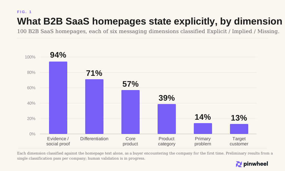
The gap between the top and bottom of that list is the finding. Companies are far more willing to prove they're credible than to say who they're for.
Companies are far more willing to prove they're credible than to say who they're for.
That's a strange asymmetry. Naming your target customer is lower-risk than most of the other five dimensions — it doesn't require a competitive claim, a technical explanation, or a number you have to defend. It's one sentence: this is for X. And it's the sentence most homepages skip.
The same is true, almost as starkly, for primary problem. Companies will tell you they're trusted by thousands of customers before they'll tell you what's broken that they fix.
Evidence and differentiation are the dimensions companies treat as marketing — the parts of the page built to persuade. Target customer and primary problem are closer to orientation — the parts that help an unfamiliar reader figure out if they're even in the right place. The data suggests most B2B SaaS homepages are optimized for the former and largely silent on the latter.
The full breakdown for all 100 companies — every dimension, sortable and filterable — is browsable at the Homepage Directness Index.
Examples
Three companies scored 6 out of 6: Cal.com, Outreach, and Resend. Every one of the six dimensions stated outright, no inference required.
Cal.com's differentiation claim is typical of what a 6/6 page looks like: “For B2B sales teams, Cal.com works as booking software with attribute-based routing, round-robin lead distribution, and CRM updates in Salesforce or HubSpot on every booking.” That's a specific, checkable claim — you could verify it's true or false by using the product.
Resend does the same thing with its core product: a code sample showing an actual API call — resend.emails.send({...}) — next to the sentence “Deliver transactional and marketing emails at scale.” No inference needed. You know what it does before you finish reading.
One company scored 0 out of 6: New Relic. But it's worth being precise about what that means, because “0 out of 6” sounds like the page says nothing, and that's not what happened. Every dimension was classified Implied, not Missing. Take differentiation: “Trace agent reasoning to code execution to identify where logic drifts from intended behavior.” That's a real sentence about a real capability. It's just never connected to a claim — never “this is what makes us different,” just a feature description you're left to draw your own conclusion from. New Relic's homepage isn't empty. It's dense with information that never resolves into a direct statement.
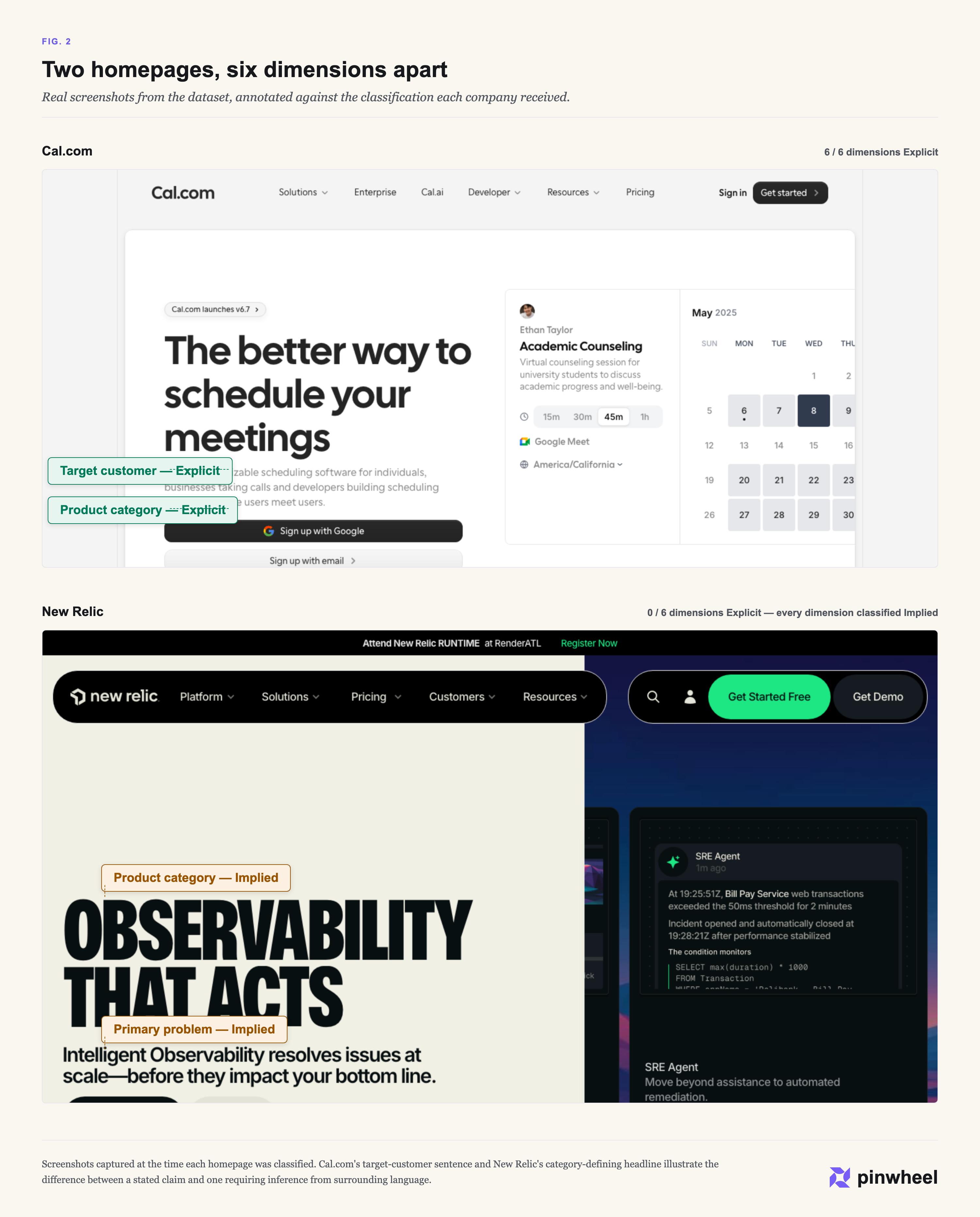
This isn't a quality ranking. A 0/6 score doesn't mean a homepage failed — it might mean the company doesn't need to spell things out for an audience that already knows who they are. That's worth keeping in mind for the next pattern, because it shows up in some of the most recognizable names in the dataset.
Notion, Figma, Vercel, Ramp, Snowflake, Databricks, Atlassian, Workday, and Okta all land at or near the implied end. Notion's product category, for instance, is never stated: the page describes what it does (“Bring everything into one system of record”) and lets a G2 award (“#1 knowledge base for 3 consecutive years”) imply the category, but never writes the sentence “Notion is a workspace app.” Figma's primary problem is the same story — “Move fast in the right direction” is aspirational, not a stated problem.
What connects these companies isn't company stage or go-to-market motion. Ramp and Vercel are self-serve products; Databricks and Workday are enterprise sales. What they share is brand recognition. These are companies whose names most B2B software buyers already know, which may be exactly why they don't bother restating the basics — the homepage isn't the first time most visitors are learning what they do.
The same contrast holds within a single dimension: asked what problem the product solves, Resend and Notion answer it differently (FIG. 3).
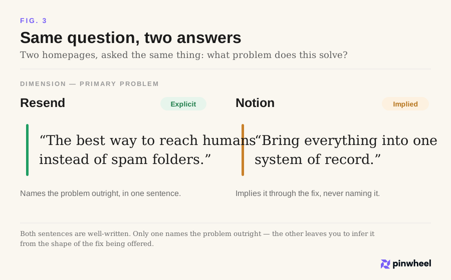
Patterns like this are only as good as the process behind them — here's exactly how each classification was made.
Methodology
Each homepage was evaluated against six dimensions: product category, target customer, primary problem, core product, differentiation, and evidence.
For each dimension, the homepage text was classified into one of three states:
- Explicit — stated directly, in language a reader could point to.
- Implied — the information can be inferred from context, features, or adjacent claims, but isn't stated outright.
- Missing — not addressed at all, directly or indirectly.
The classification was done from a fixed vantage point: a buyer encountering the company for the first time, with no prior knowledge of the brand, reading the homepage text alone. Content on other pages, prior familiarity with the company, or context from outside the page wasn't considered — only what the homepage itself says.
The dataset covers 100 B2B SaaS companies, segmented by stage: 42 startup, 42 growth, 16 enterprise. Six companies were excluded from the original candidate set — bot-blocked crawls or pilot-only runs that didn't produce usable homepage text — and are documented on the methodology page rather than silently dropped.
Classification was performed by Claude, with each judgment paired to a specific piece of supporting text from the page — the same evidence quoted throughout this piece. This is a single classification pass per company, checked with a human-review pass against the automated classifications; the numbers in this piece reflect that review.
The full rubric, including the exact prompt used for each dimension, is published on the Methodology page rather than summarized here — the goal is for the classification to be checkable, not just described.
Findings by company stage
The pattern in those examples — well-known companies skipping the basics — raised a question worth testing directly: does directness decline with company stage in general, or only among a few famous names?
For differentiation, the answer is yes, and it's not subtle. Startups state their differentiation explicitly 88.1% of the time. Growth-stage companies, 66.7%. Enterprise, 37.5% (FIG. 4). That's a 51-point spread from one end of the sample to the other.
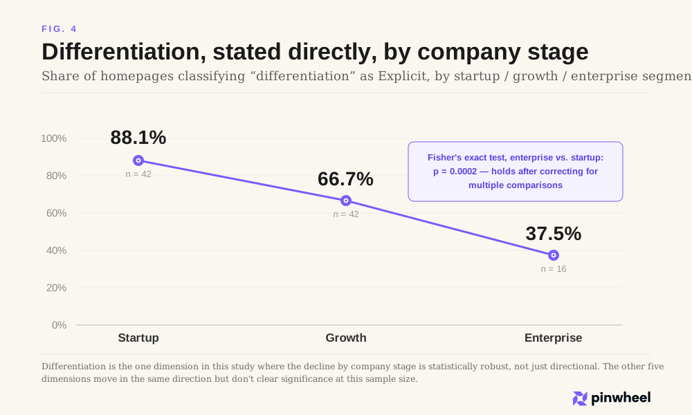
We ran a Fisher's exact test on enterprise versus startup, since the enterprise segment is smaller (n=16, versus 42 for startup and growth) and a standard proportion test would overstate the confidence. The result: p = 0.0002. That holds up even after correcting for the fact that we ran this same test across all six dimensions and both segment comparisons — twelve tests in total, which normally raises the bar for what counts as significant. Differentiation clears that bar by a wide margin. This is the one finding in the study we're comfortable stating without hedging: enterprise homepages state their differentiation directly far less often than startup homepages, and that gap is not sampling noise.
The other dimensions are less clean. Core product shows a similar decline by stage (69.0% startup, 54.8% growth, 31.2% enterprise) and is statistically significant on its own — but doesn't survive the correction for multiple comparisons. We'd call that a real pattern worth watching, not a proven one. Product category, primary problem, target customer, and evidence all move in directions consistent with the broader “enterprise is less direct” story, but none of them clear statistical significance at this sample size. And enterprise versus growth, specifically, doesn't reach significance on any dimension, including differentiation (p = 0.072) — the enterprise segment is different from startup, but the growth segment sits closer to enterprise than the headline numbers might suggest.
The honest summary: one dimension, differentiation, shows a real and substantial effect of company stage. The rest of the pattern is directionally consistent but not something 16 enterprise companies can prove on their own.
So what
If there's a practical takeaway, it's not “write clearer copy” — that's advice everyone already gives and no one acts on. It's more specific than that: most B2B SaaS homepages are over-invested in one kind of claim and under-invested in another.
Evidence and differentiation are stated explicitly most of the time — 94% and 71%. Target customer and primary problem are stated explicitly least — 13% and 14%. Those are the two sentences most homepages skip: who this is for, and what's broken that it fixes.
We don't know whether this pattern is intentional.
It may be that well-known companies assume visitors already understand what they do. It may be years of conversion optimization pushing credibility ahead of clarity. Or it may simply be how homepage copy has evolved, without anyone deciding it should.
This study doesn't answer why. It only shows that the pattern exists.
That's still useful. A homepage doesn't need to know why the gap exists to close it.
A useful exercise for any homepage: apply the same six-question test to it. Does it say, in a sentence, who it's for? Does it say what problem it solves? If the answer requires piecing together a feature list or a customer logo wall, that's the gap this study measured, on your own page.
There's a secondary implication worth naming, since it's part of why we started looking at this in the first place. AI systems that summarize or cite a company read the same homepage a first-time buyer does, without the benefit of already knowing the brand. A homepage that requires inference to understand is asking the same thing of a language model that it asks of an unfamiliar reader. We didn't design this study to measure that directly, and we're not claiming it does — but a page that can't state its own basics plainly is unlikely to be easy to summarize accurately, by a person or a model.
Close
This is the first version of an ongoing project.
The full dataset — all 100 companies, every dimension, the evidence behind each classification — is browsable at the Homepage Directness Index, along with the complete rubric on the methodology page.
This research is published by Pinwheel, a GEO/SEO company. The same six-question rubric applied here works on any homepage — including your own.